

Opening Frame
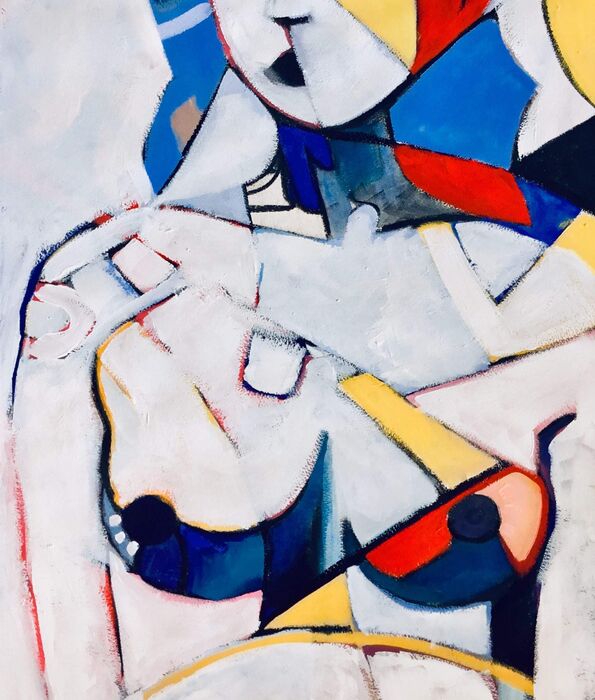
Lee Wilde’s geometric abstract painting, In a Mondrian Mood, reframes the human figure as a constellation of colour‑fields — a body refracted through disciplined geometry and softened edges. Emotion becomes structure, giving the work its architectural calm and quiet charge.
Formal Analysis — A Geometric Abstract Painting
Wilde breaks the torso into angular planes of cobalt, vermilion, ochre, and ivory. These colour blocks echo modernist grid logic, yet the composition resists rigidity: curves interrupt the geometry, softened edges temper the discipline, and brushwork adds breath. Through fragmentation, the figure retains intimacy. Light behaves like architecture, sliding across surfaces and establishing a measured rhythm of contrast and balance.
Emotional Temperature
Beneath its structural clarity, Wilde’s painting carries a gentle tenderness. The fractured body suggests vulnerability, while the primary palette introduces optimism and lift. Order and feeling coexist — colour, rather than contour, holds the figure together. The emotional temperature is warm, precise, and quietly electric.
Contextual Placement
Within Wilde’s practice, this geometric abstract painting sits at the intersection of modernist reduction and emotional realism. It extends her exploration of how the human form can be abstracted without losing psychological presence, bridging her noir‑inflected figurative works with her design‑literate compositions.
Design Literacy
Designers gravitate to this geometric abstract painting for its architectural cadence. The colour planes behave like interior surfaces — crisp, modern, spatially aware. It anchors a room without dominating it, making it ideal for minimalist or mid‑century interiors that value rhythm, restraint, and emotional clarity. It reads as both artwork and design object.
Collector Note
This artwork has been collected.