


Brand identity is the emotional and visual signature that makes an artist’s world recognisable. It’s the atmosphere a visitor steps into before they understand your process, your influences, or your story. For artists, interior designers, and creative studios, brand identity is the foundation of how your work is perceived and remembered.
WordPress.com gives artists the structure and flexibility to express that identity with clarity and intention, and now that all paid WordPress.com plans include plugins and themes, artists have full creative control from the moment they begin building their site.
A strong brand identity helps your audience understand the character of your work. It shapes how they interpret your images, how they read your words, and how they connect with your creative world. When your brand identity is coherent, your site becomes more than a portfolio. It becomes a place with its own emotional gravity.
Brand Identity Begins with Emotional Direction
Every artist’s brand identity starts with emotional clarity. Before choosing a theme or layout, you define the feeling your work carries. Some artists create quiet, contemplative worlds. Others build bold, high‑contrast environments. Some lean toward minimalism, while others embrace layered, expressive textures. These emotional cues guide every visual and editorial decision you make.
WordPress.com supports emotional direction through themes, typography, and global styles that allow artists to express mood, tone, and visual rhythm.
A painter working with soft, atmospheric colour fields might choose a theme with generous white space and gentle transitions. A photographer with a cinematic portfolio might prefer a darker palette and full‑width image blocks that create immersion. These choices help your audience feel the essence of your work before they read a single line.
Interior designers respond strongly to emotional clarity. When your brand identity communicates a consistent mood, designers can immediately imagine how your work might live within a space. This emotional coherence becomes a form of silent communication — a way of saying, “This is the world I build, and this is how it feels.”
 Choosing a Theme that Reflects your Artistic World
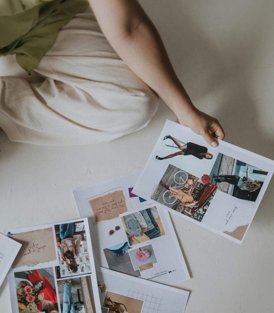
A theme shapes the first impression of your brand identity. It sets the pace, the mood, and the visual logic your audience steps into. For artists and design‑focused studios, the right theme feels less like a template and more like a space — a room built around your work, your tone, and your emotional atmosphere.
- WordPress.com offers hundreds of professionally designed themes for standout sites and stores
On WordPress.com, themes range from quiet, gallery‑like layouts to bold, image‑led designs — and with plugins and premium themes now available on all paid plans, artists can shape their site with the same creative freedom at any level.
Some create a sense of stillness, others feel cinematic or editorial. A sculptor might choose a theme with strong geometric structure to echo the physicality of their work. A collage artist might prefer a theme that supports layered imagery and dynamic grids. A portrait photographer may lean toward a theme that emphasises scale, allowing faces to fill the screen and command attention.
The goal is simple: choose a theme that behaves like an extension of your artistic world. When the structure of your site mirrors the character of your work, your brand identity becomes immediate and unmistakable.
Typography as an Artistic Signature
Typography shapes the voice of your brand identity long before anyone reads your words. Artists and design‑focused studios often choose typefaces the way they choose materials — for texture, tone, and emotional weight. A serif can feel grounded and intimate, echoing the warmth of hand‑drawn lines. A clean sans‑serif can feel modern and precise, aligning with digital or architectural work. High‑contrast pairings introduce drama, while softer forms create a sense of calm.
On WordPress.com, these choices carry through every page. A ceramicist might choose a typeface with organic curves to reflect the tactile nature of their work. A conceptual artist might prefer a stark, minimal font that mirrors the clarity of their ideas. A textile designer might select a typeface with subtle rhythm, echoing the patterns in their fabrics.
A simple list can help clarify how typography shapes perception:
- Serif fonts — warmth, tradition, intimacy
- Sans‑serif fonts — clarity, modernity, precision
- High‑contrast pairings — drama, sophistication
- Soft, rounded forms — approachability, calm
When your typography aligns with the character of your work, your brand identity becomes more cohesive and more memorable. Typography becomes part of your artistic language — a visual voice that supports the emotional tone of your site.
Colour as Emotional Atmosphere
Colour is one of the most immediate ways to express brand identity. It sets the emotional temperature of your site and influences how your audience feels inside your world. Artists and interior designers understand this instinctively — colour shapes perception, mood, and meaning.
WordPress.com’s global styles make it easy to define a palette that stays consistent across your pages. A painter working with deep oxides and earth tones might choose a palette that echoes those hues, creating a sense of continuity between the artwork and the site. A digital illustrator using neon gradients might build a palette that amplifies that energy. A monochrome photographer might lean into a restrained palette that highlights contrast and form.
Colour also guides your audience’s emotional response. Warm tones can feel inviting. Cool tones can feel calm or distant. High contrast can feel bold and assertive. Low contrast can feel soft and contemplative. When your palette reflects the emotional world of your work, your brand identity becomes more immersive and more intentional.
Imagery that Reinforces your Brand Identity
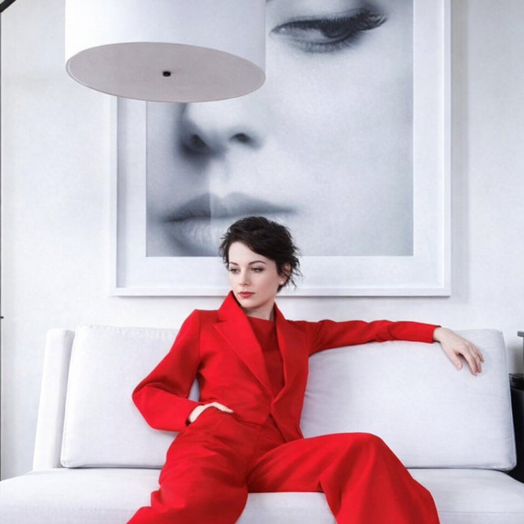
For artists, imagery is the heart of brand identity. It’s the first thing your audience sees and the element they remember most clearly. WordPress.com supports high‑resolution visuals, curated galleries, and full‑width banners that allow your work to breathe.
Consistency is key. A painter might choose to photograph their work in natural light to preserve texture and colour accuracy. A sculptor might use directional lighting to emphasise form and shadow. A mixed‑media artist might present close‑ups that reveal layers and materials. These choices create a visual language that becomes part of your brand identity.
Interior designers, collectors, and creative clients respond to this coherence. When your imagery shares a consistent tone, palette, or emotional quality, it signals intention and authorship. It tells your audience that your work belongs to a world with its own rules and atmosphere.
A short list can help clarify what consistent imagery achieves:
- recognisable visual language
- stronger emotional impact
- clearer artistic authorship
- increased trust from collectors and designers
Editorial Tone as the Connective Tissue
Your writing carries the emotional undercurrent of your brand identity. It shapes how your audience interprets your work and how they understand your values. Some artists write with quiet reflection, offering glimpses into their process. Others use bold, declarative language that mirrors the energy of their work. Some prefer a restrained, minimal tone that lets the images speak.
WordPress.com’s editor gives you the freedom to shape this voice with clarity. A photographer might write in short, atmospheric fragments that echo the stillness of their images. A painter might use lyrical, sensory language to describe colour and movement. A designer might write with precision, focusing on structure, intention, and materiality.
When your tone aligns with your visual world, your brand identity becomes stronger and more unified. The words and images begin to speak the same language. Harvard Business School Online emphasises that brand identity is strengthened when verbal and visual elements work together to create a coherent message.
Jetpack Creator helps you craft stunning content, boost your subscriber base, and monetize your online presence. It’s built for artists who want to grow their audience while maintaining full creative control.
Brand identity is built through a series of thoughtful decisions — visual, emotional, and structural. For artists and design‑driven studios, WordPress.com offers the tools to express that identity with clarity and intention. When your theme, typography, colour, imagery, and tone work together, your site becomes more than a portfolio. It becomes a world your audience can recognise instantly. A strong brand identity helps your work travel further, resonate more deeply, and live more confidently in the minds of those who encounter it.
WordPress.com offers artists a flexible, design‑driven foundation — and with plugins and premium themes included on all paid plans, your brand identity can evolve without technical limits.
Further Reading: