

The New Base Neutral: Tonal Charcoal Succeeds Pale Grey
Sourcing Art for the Sherwin-Williams ‘Rewild’ Shift
Major colour forecasters confirm that 2027 will be defined by deeper, moodier tones. In the Sherwin‑Williams Colormix 2027 Trend Forecast, interior designer and colour strategist Emily Kantz notes that “moody charcoals are replacing pale grays” and that gray is simply “getting deeper.”
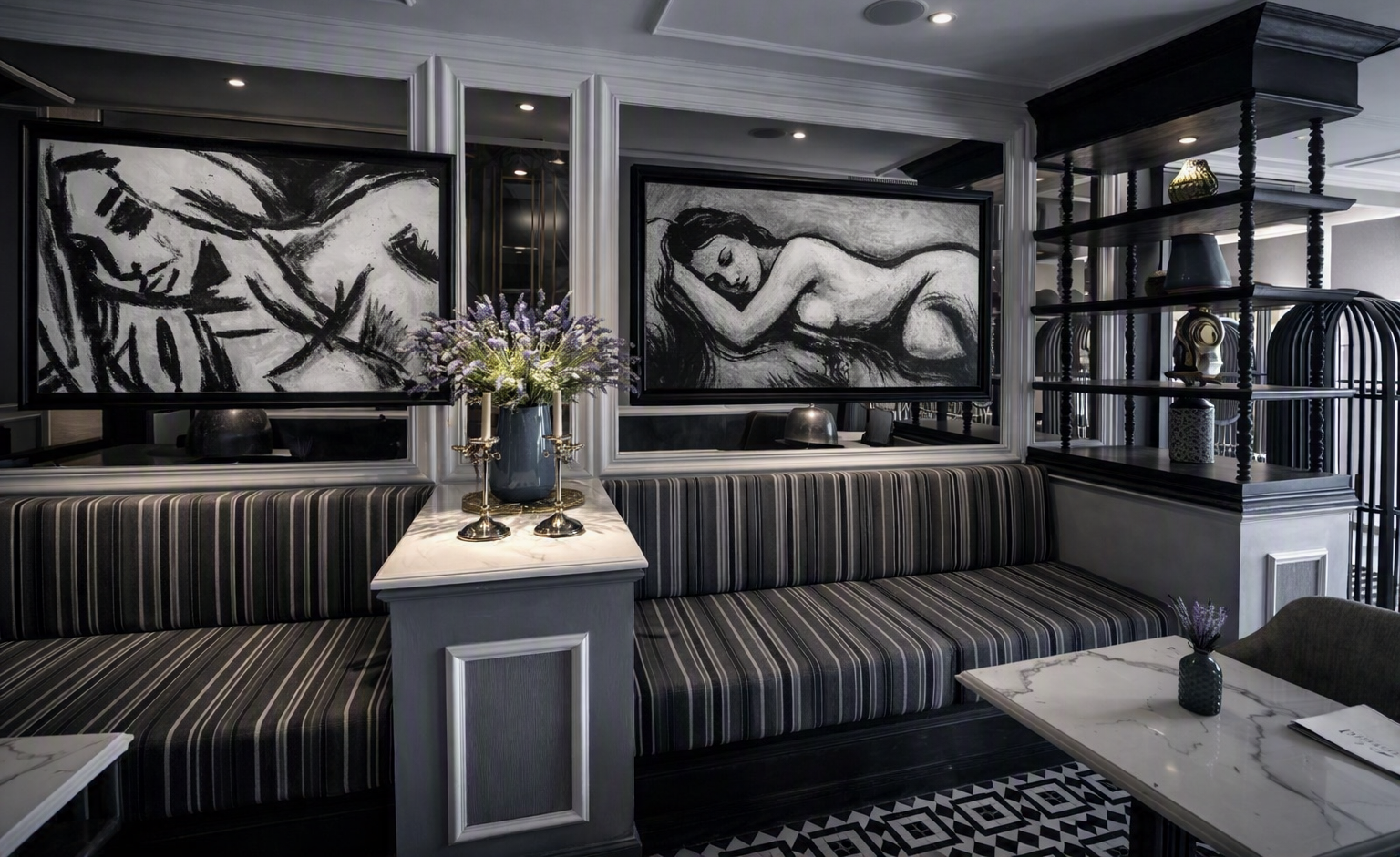
 A moody, modern interior where the painting ‘Dressing’ adds emotional depth and cinematic contrast to the dark grey palette.
Mapping Monochromatic Art to Deep Architectural Walls
As charcoal moves from background accent to dominant interior tone, designers are selecting artworks that create a cohesive monochromatic flow within these darker environments. Charcoal and graphite portraiture naturally complement this palette, echoing the depth and sophistication of moody walls rather than competing with them. Hanging monochromatic works against deep charcoal walls creates a unified visual field where artwork and architecture speak the same language.
Achieving Monochromatic Flow in High-End Residential Design
Monochromatic art sits naturally within the shift toward tonal charcoal. Graphite, charcoal and black‑and‑white portraiture integrate seamlessly into desaturated interiors because they share the same visual vocabulary. This alignment strengthens monochromatic work in three key ways:
- It reads as an intentional extension of the architectural palette.
- Its emotional realism becomes more pronounced against neutral, desaturated walls.
- Its cinematic depth complements the controlled lighting designers are favouring for 2027.
Designers are increasingly choosing monochromatic pieces not only for aesthetic impact but for architectural coherence. These works function as part of the spatial strategy, reinforcing the calm, deliberate atmosphere that defines the 2027 palette.
 Contemporary bedroom interior featuring the monochrome figurative painting ‘Mina’ by Lee Wilde, above a velvet‑upholstered bed, where soft lighting and warm textures create a cinematic contrast between art and design.
Texture as a Spatial Anchor in 2027 Interior Palettes
2027 interiors are moving away from flat, digitally printed wall art in favour of tactile, handmade pieces that feel grounding and human. When colour is stripped away, the physical structure of the art steps forward to tell a story of light and shadow.
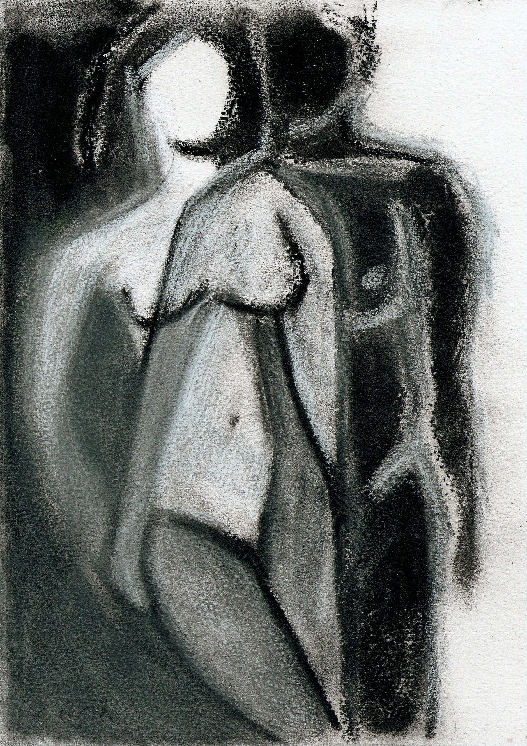 Charcoal Drawing – Shadows of Self by Lee Wilde
Charcoal dust, smudged gradients and the metallic sheen of graphite create dynamic texture that shifts with changing light. As the day moves, the artwork evolves, offering a quiet, tactile counterpoint to digital saturation.
Home decor reports highlight a surge in gentle sketches in charcoal tones chosen for their calming presence in busy lives. About Wall Art
The Chiaroscuro Effect: Anchoring Saturated Accents with High Contrast Fine Art
While tonal charcoal anchors the 2027 palette, designers are also embracing highly saturated nostalgic colours such as Luminous Blue, Energy Orange and Pop Pink. Industry commentary describes the year’s direction as “embracing the tension of contrasting colors.”
In these environments, monochromatic art becomes the structural anchor. A black‑and‑white charcoal drawing provides a visual rest point that stabilises the room, allowing saturated accents to feel intentional rather than overwhelming. Its “monochromatic palette, restrained visual language, and contemplative presence” ground the space and elevate its maturity.
This chiaroscuro‑like balance allows bold colour to coexist with design‑grade restraint. Charcoal drawings introduce tonal discipline, guiding the eye back to a calm centre and reinforcing the architectural clarity that defines the 2027 palette.

Material Library Forecast: The Materials Defining Next-Season Mood Boards
Material libraries and design studios are already signalling the direction:
- Desaturated greys replacing beige and terracotta.
- Charcoal‑based fabrics in wool, linen and textured blends.
- Mineral black accents used sparingly as visual anchors.
- Soft graphite gradients in wall finishes.
- Palettes that support emotional realism and atmospheric portraiture.
This is the palette that makes monochrome feel modern rather than nostalgic. It elevates figurative work into a design tool.
Specifying Charcoal Art: The Interior Designer’s Guide
Monochromatic art does not simply fit the 2027 Interior Palette. It anticipates it. As tonal charcoal becomes the dominant architectural direction, works grounded in graphite, charcoal and restrained black‑and‑white values align naturally with the palette designers are preparing for next season.
This moment highlights several strengths of monochromatic practice:
- The architectural intelligence of a palette built on tonal discipline.
- The emotional clarity that monochrome brings to desaturated environments.
- The ability to anchor space without adding colour weight.
- The designer‑grade restraint that defines contemporary noir aesthetics.
Designers want interiors that feel composed, intentional and emotionally steady. Charcoal art embodies that future, offering a visual language that supports the architectural shift rather than reacting to it.
How to Style Charcoal Art within 2027 Interior Palettes
- Frame graphite drawings with thick, textured white or off‑white matting to create crisp vignettes against charcoal walls.
- Mix mediums by pairing a rough, smudged charcoal portrait with a highly detailed graphite landscape for tonal contrast.
- Use monochromatic pieces as visual anchors in rooms featuring saturated accent colours.